One of the most common issues faced when marketing products and services online are how to convert website visitors into paying customers.
Thankfully, there are a variety of mechanisms and tools which can improve conversion rates.
One of the main methods commonly used is call-to-action (CTA) buttons.
These “call-to-action” buttons act and serve, as visual stimuli for website visitors to encourage a click-through to a relevant page.
[Tweet “What impact do call-to-actions have on web pages, and how they affect conversion?”]These-call to-action buttons guide the user through the website and are essentially an internal link, within the website
Call to action is important, and strangely it’s often an area that is neglected by designers and businesses.
A recent suggests that 53% of companies spend less than 5% of their total marketing budget on website optimisation, despite the fact that a small uplift in conversion rates can translate into additional revenue.
Experiment with new colours and styles
Experimenting with new colours on your CTA text and buttons may improve your conversion rate.
Research suggests that colour can have a direct impact on conversion rates. For example, SAP discovered that orange improved their conversion rate by over 32.5%.
In addition, HubSpot revealed that the colour red improved their website conversion rate by 21% when split testing alongside a green button.
 HubSpot split tested the same two pages, but with different colour CTAs – Image Source
Placement of call to action buttons
It can be a difficult task to accurately measure the impact of the location of your CTA in correlation to the success of your marketing campaign. What impact did the location of your CTA button actually have?
By frequently testing different areas to place your CTA, such as and below the fold, increased campaign awareness and efficiency becomes easier to measure.
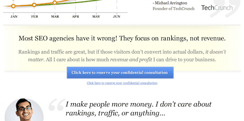
Neil Patel, founder of Crazy Egg and KISSMetrics found that the CTA on his web pages performed best below the fold.
 Where is your CTA button? Neil Patel found the button worked best below the fold on his site
This was because his readers wanted to read the full page content before engaging with any call to action – this makes sense, as visitors will often want to ensure the article is of good quality before, say, sharing it with their friends or subscribing to Neil’s newsletter.
The Message: What CTA copy to use?
Offering something your visitors want is one way to increase conversions, and by customising your call to action buttons you can appeal to more of your potential customers.
The key to finding what text works on your call to action buttons is experimenting with, and testing, different ways of selling your product.
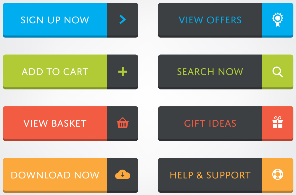
 Examples of common CTA buttons
For example, if you were selling coffee beans you may wish to adopt for the “Buy Now” , “See More” or “Add to basket” approach.
Each of these keywords describe the sales process differently; “buy” is a definitive command, whilst “now” adds a sense of urgency.
Decide on what type of keywords, and the intent behind these keywords, carefully before running any tests.
Think about user intent, size and creating one simple, effective customer journey
Your visitors need some way of understanding your product or service, some sign of what it actually does, what brand experience is happening, and also what the alternative course of actions are available should they wish to visit another page.
Potential customers will search for a variety of clues, often for any sign that might help them cope and better understand the situation.
Anything on your website which may lead to something or create an action, such as downloading a PDF or an e-mail newsletter sign-up button, are all classified as call-to-actions, as they commit the user to an action.
Make good use of CTAs such as social media icons on your website, for example Facebook “like” and “share” buttons, as these CTAs can encourage an increase in social media followers and shares.
Placing call-to-actions on your blog or news section, weekly or monthly e-mail newsletters, and throughout any important page on your website, you help improve can increase your conversion rate.
The goal is to drive visitors through the website and reach an end-point, such as completing a contact form, signing up to an offer, or purchasing an item.
Therefore, the more opportunities which are given to the visitor to take that action, mean that website visitors can more easily navigate to the relevant page and complete your desired goal
Providing a great user experience is the key goal to increasing engagement on your website. The goal is to allow your website visitors to carry out your desired actions with as little thought, and as easily as possible.
Related: Beginners guide to split testing
Stay UX focused
Matt Cutts, Head of Google Spam mentioned in 2013, that “a pleasant and informative online encounter will do much more for a brand’s content marketing strategy than making the smallest tweaks to linking structure or keyword selection.”
This shows that Google are focusing closely on user experience and site interactions – do not let technical SEO practices like keywords and internal linking get in the way of user experience.
Making sure that your call-to-actions are easily guiding the user through your desired funnel will serve only to further increase visitor satisfaction rates..
Conclusion
Call-to-actions are imperative to the success of your website’s aims and objectives. These should be tested to provide the best possible user experience.
By testing and experimenting with new colours, styles, layouts, placement and text on these you can achieve an improved conversion rate on your website.
Your Say!
Do you consider the impact of CTAs on your sales pages? Have you ever set up an A/B test to determine what worked best? What were your findings? We’d love to hear from you.

9 thoughts on “The Importance of Call to Actions and Improving Conversion Rates”
Comments are closed.