When a visitor arrives at your website, you have a unique opportunity to impress.
Whether you want prospects to sign up to your email list or make a purchase, there are steps you can take to make your landing page more appealing to your potential new customers.
By studying and testing different elements of your landing page, you will be able to identify how best to optimise it so that it is persuasive and compelling.
Whether it is the font you use, the size and colour of your ‘Buy Now’ button or the wording or design of your calls to action, you can test and measure a range of options so that you end up with a landing page that is highly effective for your target audience.
Related: The ultimate guide to increasing conversions
Why is landing page optimisation important?
There is no single, definitive guide to which features of a website will lead to success because every website’s audience is different.
What works for one company may be a complete flop for another and so, while one business may swear that changing their ‘Buy Now’ buttons from red to green or making the headline 50% larger boosted their sales by 300%, their competitors may find that the opposite is true.
Each aspect needs to be tested to see how your own target customers react.
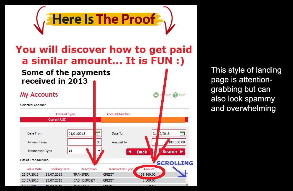
The following landing pages both sell recipe books. Our first example is very cluttered and full of hype. It makes it a little difficult, as a potential customer, to know exactly where to look.

Our second example couldn’t be more different. It delivers a simple message, making the whole thing a lot more subtle and easy on the eye.

Because customer demographics and preferences can be so varied, it is impossible to say which of the two approaches will be the most successful. This is where testing becomes invaluable.
Related: Why your site needs multiple landing pages
How does landing page optimisation work?
There are two main methods of testing in landing page optimisation: A/B testing and multivariate testing. A/B tests compare the behaviour of customers by using two variations of a landing page.
Version A is tested against version B and they are identical except for one feature. This makes A/B testing relatively simple and straightforward.
Multivariate testing compares many different combinations of features at the same time. Multivariate tests tend to be most suitable for experienced practitioners with websites with large numbers of visitors.
The results of multivariate testing are detailed and highly specific and they can be monitored in real-time.
Once you have chosen a method of testing, it is also important to decide what to measure.
This could be sales, bounce rate or subscriptions to an email mailing list. If you are not clear on your optimisation goals, the tests will not provide you with any meaningful data.
Related: Beginners guide to A/B testing
What to test?
There are many aspects to a landing page, so it is easy to feel overwhelmed by the number of variants. If you are new to testing or are working with a new website, choose one or two characteristics to start with and build up from there.
Some popular options for landing page testing include:
Headline
Test different headlines, perhaps comparing long ones with short ones. You can also look at the colour or size of the headline on the page.
Design
This can incorporate the layout of the page, whether it is cluttered or minimalist, and the colour scheme.

Copy
The wording of your landing page can make all the difference to your conversion rate. Some audiences respond well to hard-hitting, persuasive copywriting while others prefer a more gentle approach.
Call to action
If you want a high conversion rate, a call to action is essential. Calls to action can take many forms, from flashing ‘click here!’ buttons to a subtle prompt to make a purchase.
Test out the wording and design of your call to action, and place it at different locations on the page to find the most successful combination.
Images
Do you use images or photographs on your landing page? Test different styles and positions to find out which is most appealing to your client base.
Pop-ups
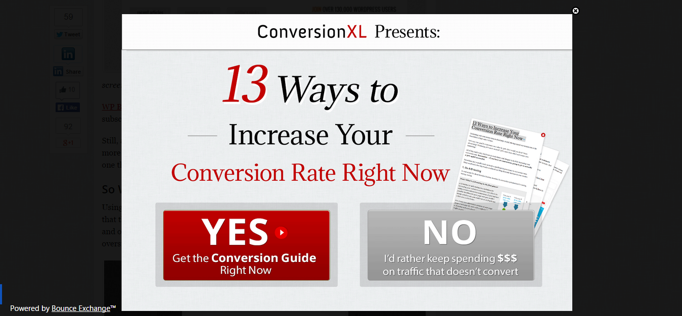
Love them or hate them, many marketers credit pop-ups with boosting their conversion rates.
However, potential customers can also find pop-up boxes obnoxious and off-putting.
Test your conversion rates with and without a pop-up box and, if using the pop-up proves to be more effective, try out different styles, designs and timings.
Length
The only reliable way to discover whether a long, Amazon-style landing page with lots of scrolling or a brief, single-screen design is more effective for your website is to test it thoroughly.
Social sharing buttons
Do you get more shares if you only provide icons for just Facebook and Twitter or do you have more success if you make dozens of networks available? What about the positioning of the social sharing icons?
The all-important offer
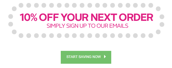
If you want people to sign up to your mailing list, test your page with two different freebies. Or, if you are aiming for immediate sales, test the success of offering free shipping versus a 10% discount.
Related: 5 landing page split tests you should be using
What’s next?
Remember that even small variations in success matter. If you boost your conversions by 0.5% with one change it might not look particularly impressive. But if you can combine that with four or five other 0.5% improvements, it all adds up to a significantly improved conversion rate.
It is important, at this stage, to not become complacent. Tastes and preferences change, so don’t simply test things once and then abandon the project.
Google reportedly tested 41 shades of blue to find out which resulted in the most clicks, so don’t get left behind by failing to test and improve your website on an ongoing basis to ensure you are achieving the best conversion rates you can.
Your Say!
Have you started to build out different landing pages for your website? Let us know how you measure and test you results?
As a consumer, would do you look for in a landing page? And what puts you off?
Get in touch in the comments below 🙂

8 thoughts on “The Beginners Guide to Landing Page Optimisation”
Comments are closed.