Conversions are important markers in the flow of your visitors’ interactions with your website and your business.
Like breadcrumbs through the forest, conversions show when your customers are compelled enough to sign up for your newsletter, download a free trial, or buy now.
If your conversions are stuck below 5%, you are missing out on key interactions and sales that will boost profits.
[Tweet “10 reasons why your conversation rates are so low…”]Engage website visitors and make it as easy as possible for them to perform the actions that you want them to do.
Find out what is making your visitors click away before making the choice to commit. Armed with this knowledge, you can make landing page changes that will convert visitors into customers.
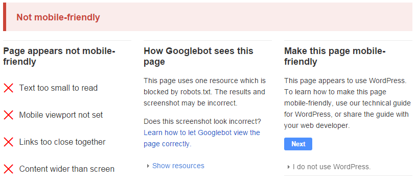
1. Your website is not mobile-friendly.
You may have a beautifully laid out landing page, but if it does not translate well to smartphones and tablets, you are missing out on a large portion of your conversions.
Mobile users are quickly dominating the landscape, and if they cannot easily navigate your website, they will leave without signing up for your services.
There is no guarantee that they will return when they find themselves at a computer, so test your website functionality on a variety of devices and mobile web browsers.
This is more important than ever now that mobile-friendliness is a ranking factor for Google.
 Will your site pass the mobile-friendliness test?
While you’re at it, break out your laptop and make sure your landing pages look beautiful in multiple browsers as well, to confirm that all of your visitors are having the same experience.
Content management systems such as WordPress make it easy to get a responsive website online, with hundreds of free responsive templates available.
2. You do not have anyone focused on conversion rates.
As a solopreneur, you may be studying your analytics and making changes to your landing pages on a whim, while juggling all of the other aspects of your business.
This multitasking approach can make your conversion optimisation plan scattered, as you may not have time to implement changes effectively.
A handful of changes here and there may or may not be effective, and you are likely too busy to find out.
If you are doing it all on your own, outsourcing landing page optimisation might be right for you.
Even if you have a team of people working on your startup or small business, if there is no one who is committed to increasing conversion rates and optimising web pages, your efforts won’t be as effective as they could be.
Keep everyone in the loop about your conversion rate performance, while giving one person the primary task of improving conversions on a regular basis.
3. Your visitors do not know what you want them to do.
A jumbled web page with multiple calls-to-action will only confuse visitors, causing them to bounce away from your site without making any decision at all.
On each page, have a single, primary call-to-action that leads them to take the next logical step through your website.
For example, a blog post’s primary call-to-action would be signing up for similar content via your company newsletter.
A product page would have a buy now button, with no unrelated offers to distract from sales. Your visitors should have no question in their minds, which will increase conversions.
A minor exception to this could be having a buy now button for your software, next to a button to download a free demo.
In this case, your buy now should be in a bright, contrasting colour, while your free download button should be more muted.
4. Your intake forms require too much information.
Any forms present on your website, from newsletter sign ups to shipping information, should ask for the minimum amount of information needed to complete the requested action.
Each field you add increases the risk that the visitor will get bored or feel that it is too much trouble to complete.
 Only ask for the information you need, else you risk getting nothing!
Depending on your industry, you may require more initial information to begin, such as a lawyer or banker requiring personal information about the visitor’s needs to provide a free consultation.
Your visitor may not feel comfortable sharing this information immediately, or may prefer talking about it in person or over the phone.
If you must include multiple fields, do not make them required information.
5. Your unique selling proposition is not clear.
If a visitor does not understand what your business is trying to provide, they will find a business that expresses their unique selling proposition (USP) more clearly.
Crafting a succinct USP can be tricky, as they are often too vague to be useful, or full of business buzzwords that are meaningless to almost everyone.
Make your USP short and sweet. Don’t try to cram everything about your business in one or two short sentences; instead, strike a balance between your core values and your business’ purpose.
A great example of this is Kiva’s (a US non-profit USP crowdfunding organisation): “Loans that change lives.” In four words, they have communicated who they are and what they do to their visitors.
Your USP may not be that short, but make it as easy to understand as possible.
6. Your landing page copy is not persuasive enough.
Just because someone visits your page does not mean they are ready to hand over their credit card.
You have to convince them that your business alone is the right choice for them to provide the products and services they need.
You need clear, persuasive website copy, with a clear call-to-action that compels your visitors to convert.
 Is your landing page copy hurting your conversion rates?
If you don’t have the time or patience to learn solid copywriting techniques, consider hiring a copywriter to optimise your website copy to improve conversions.
Your communications with your website visitors are essential to increasing your conversions, by clearly presenting your business in a positive, helpful light.
7. Your marketing efforts are all about increasing visitors, not conversions.
You have taken to heart that the old mantra “build it and they will come” does not apply to websites.
You have directed all of your marketing techniques to increasing your daily website traffic, perhaps to the detriment of your conversions.
[Tweet “Unqualified leads are just as bad as no leads at all. Focus on boosting conversions.”]Unqualified leads are just as bad as no leads at all. It does your business no good to have thousands of unique visitors per day, if none of them are interested in what you’re offering.
Tighten up your marketing focus, and you will find that more of the people who land on your website are looking for your particular services.
8. Your checkout process is too difficult or confusing.
Customers want a clean, efficient checkout process. If they have to jump through hoops to complete their purchase, they will abandon their carts and shop at your competitor’s website instead.
Make the process as simple as possible, minimising distractions that can dissuade them from finishing the process.
Do a run through of the shopping process yourself, to look out for any technical errors or bugs that can disrupt customers.
 Keep your checkout flow simple and as short as you can
Make sure there is no reason for your customers to come across a 404 page through normal use, and consider giving them a cancel page if they are unable to complete the order right away.
Your cancel page can give them the opportunity to save their cart for later, resume checkout, or live chat with customer service, which will capture customers who need a little bit of a push to buy.
9. Your customers are suffering from decision paralysis.
Not an actual medical affliction, decision paralysis can affect website visitors who are presented with too many purchasing options.
After making the decision to search for a website, click on yours, read more about your offerings, then look at your sales page, your visitor’s ability to make complex decisions is already tapped out.
They want to make the easiest decision possible, so if you have too many options, the easiest decision will be to click away.
Narrow your products down to as few as you can manage. On many SaaS websites, you will notice that they offer three options, with the middle package labelled as the best deal.
For the busy shopper, this makes the decision easy, as they will instantly know they aren’t getting the bare bones option, nor the high-end corporate package: like Goldilocks, it will be just right. If you have multiple services, put each group of packages on separate sales pages.
10. You lack social proof.
Your visitors may like what they’ve seen so far, but if they are brand new, they may have never heard of you.
It is risky for them to immediately put their trust in a company they are unfamiliar with, and if you are fairly new, it is likely that their friends and family haven’t used your services before either.
Rather than having your visitors bounce because they don’t know you well enough, provide immediate examples of social proof.
 Using a real tweet as social proof – LCN.com homepage
Make client recommendations easy to find, by featuring a few of them on your sales page and having the rest under the testimonials tab.
If you have received any reviews from well-known leaders in your industry, put those front and centre. Establish trust with your visitors, and they will quickly convert into customers.
Conclusion
Improving conversions does not have to be a difficult proposition. Think like your customers, and optimise your website so all of their questions and concerns are properly dealt with.
As you test these changes, you will see your conversion rates improve, and break out of the 5% conversion rate slump.

3 thoughts on “10 Reasons Your Conversion Rates Are So Low”
Comments are closed.