When you run an e-commerce store, every click, word, ad and price change counts. E-commerce is incredibly competitive, so most webmasters find that they need a lot of trial and error before they start making consistent sales.
You want to engage users and avoid any techniques that compel them to bounce from your site and move on to a competitor’s site.
Here are some tips to help you improve your conversion rate and make more sales.
Limit Choices and Be Specific about Products
When you go to a restaurant and have too many choices, some people take even longer to decide and can difficulty making a specific selection. The same concept works with e-commerce stores.
If people have too many choices bombarding their view, users may feel overwhelmed and just bounce from the page. Ideally, you should try to keep your primary page goal to just one key action; such as adding a product to a basket or subscribing to a newsletter.
Your pages should discuss the product, include reviews, list the price and then display a prominent call to action (CTA) that tells readers how they can buy the product. Don’t clutter your site with several flashy choices that make it too difficult to make a selection. With e-commerce, less is often more.
Let Customers Leave Reviews
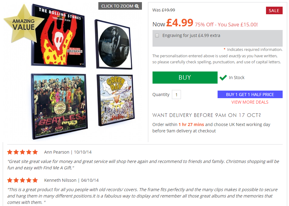
Letting customers post reviews on your e-commerce is a great way to build trust in your products.
Many e-commerce content management systems have functionality for posting comments to a product page via a form or even using Facebook, and Google+ comments.
 Customer reviews – findmeagift.co.uk
To encourage happy customers to leave reviews for you, trying offering them an incentive, such as 10% off their next order.
Include these reviews on your product pages and let users freely discuss and comment your products. Try not to censor negative comments where possible – negative comments are an opportunity to improve your understanding of your products and gauge valuable customer feedback.
Display Inventory Numbers
If users think you have low stock for items they want, they might be more inclined to purchase now instead of waiting and risking the item going out of stock all together.
If you have low stock on a particular item you are trying to sell fast, like old-season stock, letting customers know inventory numbers can help give the product the extra push it need.
eBay does this very effectively by not only showing stock numbers but how many have been sold since the item has been listed. This gives a sense of urgency which may help a customer make a decision to purchase.
 Stock levels – ebay.co.uk
Offer Loyal Customers Incentives to Come Back
There are several ways you can offer incentives to existing customers, but you should offer something that entices customers to come back.
Existing customers are a great way to keep your business going during the slow seasons, and you already have their information and buying patterns to identify the best incentives.
 Double discount is a great incentive to get existing customers shopping again
You can offer a promotion that gives current customers a discount on products you know they like, or you can offer incentives for customers who refer new customers to your store.
Get creative with the way you offer incentives, and you’ll find that even a small marketing budget can significantly boost new sales.
Make Your Contact Page Professional
A site with no contact page or a contact page with just an email address will not really instil trust in your visitors. Avoid use Hotmail, Gmail, or Yahoo as a contact email address. A custom domain name is cheap and easy to set up and it looks so much more professional (find our domain search here),
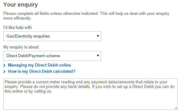
If possible, use a contact form so customers can fill in their details without having to navigate from the page and open their email client to send.
 Simple contact form – BritishGas.co.uk
If you have a local store, include the store’s address and a map to that address. Make it as simple as possible to contact you. If you hide any details, it will worry potential customers.
Create Clear Navigation
If users land on your web page from a search engine and want to read more, where do they go?
Poor and confusing navigation can frustrate users who will usually quickly bounce from your website and continue searching.
Make your navigation clear and prominent on your site, so there is no confusion. Users expect navigation to be either on the left or the top of the site.
Site design and layout requires some trial and error with some experiments that gather statistics on what engages users better.
Add a Related Products Section
Suppose somebody lands on your site on a page that sells red t-shirt, but the user really wants a blue t-shirt. In this scenario, the user isn’t getting exactly what they want, but its close.
To engage the user instead of forcing him to bounce from the site, add a related product area that’s visible on the page.
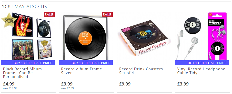
Users see the related product and click the link instead of leaving the site. Of course, this can also be done by adding a widget to your products page that displays the list of colours available.
The key point is to reduce the amount of searching or clicks needed for the user to find the exact product they want.
 Related products section – findmeagift.co.uk
Always Use High-Quality Images
Nothing turns off an ecommerce customer like low-quality images. Even if the image is a stock photo from the manufacturer, ensure you display the highest quality for users.
Don’t skew the photo or make it hard to see the product. This concept is also true for mobile images. While mobile images must have reduced resolution for better performance, poor quality images will drop your conversion rate and sales drastically.
If you house the products locally, take custom images but hire a photographer for your images.
Having unique photos separate from competitors will improve your sales since users will get better photos than the same ones offered by your competitors.
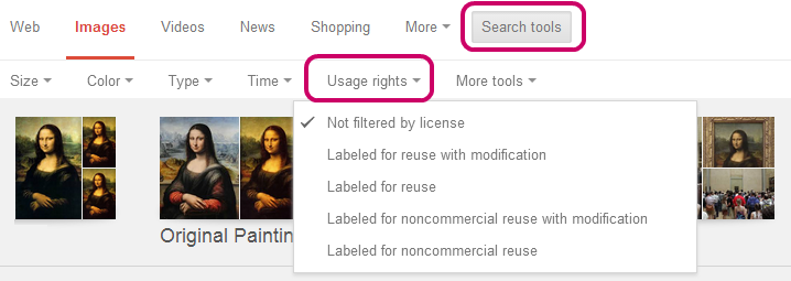
Check out our guide to the best image resources on the net.
 Google advanced search to find royalty free images
Conclusion
These tips will help you engage users, and engagement leads to conversion, should be your focus when working on an e-commerce store.
Track your conversions, test your layouts, and always keep customers your number one priority.
Your Say!
Do you run an online shop? Have you already implemented these tips, or give us a shout if you have any other great tips!

One thought on “8 Tips to Boost E-commerce Conversion Rates”
Comments are closed.