Accessibility is a part of the design process focused on the user experience, making websites usable by the widest range of people (using the any device) possible.
It’s important to remember that it’s not just beginners or inexperienced Internet users that benefit from accessible design, but also people with varying visual, mobility, hearing, and intellectual abilities.
[Tweet “Make your website more accessible in 7 simple steps…”]Here we’ll look at various steps you can take to make your website more accessible to your audience.
Why Accessibility is Important
Even if there are no mandatory web accessibility requirements in your country, you should still address accessibility issues because there are a number of additional benefits, including:
. More people are able to use your site, meaning more potential customers
. It improves the experience for mobile users
. It improves your search engine rankings
Consider Accessibility During the Design Process
During the initial web design stages and whenever you’re publishing new content, try to keep in mind a number of design elements that improve accessibility.
Among other things, these include the reading order, colour contrast, font size, and clear links. WebAIM.org (Web Accessibility in Mind) has created a helpful accessibility infographic with some of these design best practices.
Ensure Content is Logical and Navigable Using Only a Keyboard
Some users with mobility disabilities can’t use a mouse or trackpad but can access content using the “tab” key or other input devices.
Therefore, make sure the tab order matches the visual order, so there is a logical progression through the content.
When a page contains a lot of content, break it up with anchor texts, so users can skip to other page sections.
It’s also good practice to have a “Skip to main content” link at the top of each page, so users can avoid having to tab through the main navigation links.
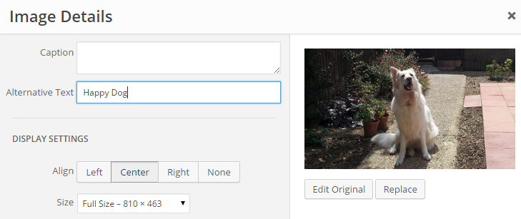
Use Alternative (Alt) Text for Images
The web is used by many people who are visually impaired. They use tools to help them read the text and also “see” other page elements.
 Editing an image alt tag in WordPress
Alt-text is one of the main ways of making visual information accessible. As search engine crawlers cannot actually “see” images, it’s also an important technique that strengthens search engine optimisation (SEO).
Alt-text is helpful in various situations:
. For people using screen readers and speech input software
. For people browsing speech-enabled websites
. For mobile users when images can’t be displayed
To find out more, visit this WebAIM guide to alt text and our guide to optimising images for SEO.
Use Sufficient Colour Contrast Between Text and Background
Up to one in twelve people have some type of colourblindness, but these aren’t the only people that struggle to distinguish between elements on a web page; users with learning disabilities can benefit from contrasting colours in order to comprehend content.
Use higher colour contrasts between the text and background and try using more white space and borders to separate blocks of content.
 Try to ensure the text on your web page is easy to read, but avoid making it too bright since this can also lead to eye fatigue
Having enough contrast between the words and the background just makes reading easier and more pleasant for everyone, especially when using a mobile device.
To check your colour contrast levels, use WebAIM’s colour contrast checker.
toptal.com/designers/colorfilter will also filter your website to emulate different types of colourblindness.
Use Descriptive Links
Using the words “click here” in links is not always helpful for screen reader users or search engine robots.
Try using text that describes where the link will go. Visually impaired users can scan through links just like sighted users, so using descriptive text helps to explain the context of each link.
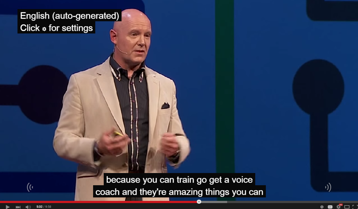
Provide Captions for Embedded Video
Captions provide content in real-time for users who don’t have access to audio. There are closed captions, which can be turned off and on, or open captions that are embedded directly in the video file.
 Captions are now available on many YouTube Videos
To meet basic guidelines, captions should be properly synchronised with content, and be accessible on a variety of devices.
To find out more, read this WebAIM article on captions, transcripts, and audio descriptions.
Related: 5 YouTube videos every business needs
Test Your Website on a Mobile Device
There is a significant crossover between accessibility and the mobile user experience. A website built with a clean design that is user-friendly may go a long way toward meeting accessibility goals.
To ensure your users have a good website experience, test your site on a mobile device. Google Analytics has a page speed analysis tool for mobile devices and a tool to check for mobile-friendliness.
This is more important than ever now that Google has confirmed that mobile-friendliness is now a ranking factor.
Conclusion
This is just a roundup of some key steps you should take to ensure your website is more accessible.
Implementing these suggestions will not only improve accessibility but also help search engines understand your site better, which should increase your search rankings.
For more accessibility web tips, visit the following pages:
Your Say
Is your website accessible? Has anyone ever contacted you regarding the accessibility of your site? Share your experiences in our comments section below.

My wwebsite is http://www.libertyasiancateringservice.co.uk
Since this website was made I don’t see any traffic is coming through.can you suggest.
Hi there. I’d definitely recommend checking out our SEO guide at https://www.lcn.com/learn/seo – Thanks